Analyzing US Drought data
By Manuel Rademaker in R Data wrangling Data analysis Data visualization Tidyverse ggplot2
July 23, 2021
Description
The data this week comes from the U.S. Drought Monitor.
This dataset was covered by the NY Times and CNN.
The dataset for today ranges from 2001 to 2021, but again more data is available at the Drought Monitor.
Drought classification can be found on the US Drought Monitor site.
Data and variables
There is only one data set. Looks interesting. I guess we are going to make some maps, which is exciting since I haven’t worked with maps in a long while.
drought.csv
| variable | class | description |
|---|---|---|
| map_date | double | Date map released |
| state_abb | character | State Abbreviation |
| valid_start | double | Start of weekly data |
| valid_end | double | End of weekly data |
| stat_fmt | double | Statistic format (2 for “categorical”, 1 for “cumulative”") |
| drought_lvl | character | Drought level (None, DO, D1, D2, D3, D4) which corresponds to no drought, abnormally dry, moderate drought, severe drought, extreme drought or exceptional drought. |
| area_pct | double | Percent of state currently in that drought category |
| area_total | double | Total land area (sq miles) of state currently in that drought category |
| pop_pct | double | Population percent of total state population in that drought category |
| pop_total | double | Population total of that state in that drought category |
Setup
require(tidytuesdayR) # to easily get the tidy Tuesday data
require(tidyverse)    # includes dplyr, tidyr, ggplot, forcats etc.
require(visdat)       # for visualizing missing data (and data types)
require(lubridate)    # working with dates
As always here are the main steps I’m going to take:1
- Load data and get an understanding of the variables
- Develop interesting questions/hypotheses
- Tidy/clean
- Address questions/hypotheses
The goal is to come up with 2-3 insightful, publication ready visualizations.
Load data and get an understanding
tt  <- tidytuesdayR::tt_load('2021-07-20')
d <- tt$drought
dim(d)
## [1] 325728     10
325,728 observations on 10 variables.
d %>%
   count(state_abb) %>%
   arrange(desc(n))
## # A tibble: 52 x 2
##    state_abb     n
##    <chr>     <int>
##  1 AK         6264
##  2 AL         6264
##  3 AR         6264
##  4 AZ         6264
##  5 CA         6264
##  6 CO         6264
##  7 CT         6264
##  8 DC         6264
##  9 DE         6264
## 10 FL         6264
## # ... with 42 more rows
unique(c(year(d$valid_start), year(d$valid_end)))
##  [1] 2021 2020 2019 2018 2017 2016 2015 2014 2013 2012 2011 2010 2009 2008 2007
## [16] 2006 2005 2004 2003 2002 2001
Complete. All states are there and have the same number of observations. Observations range from 2001 until 2021. Observations are in a weekly format:
d %>%
   filter(state_abb == "AK") %>%
   arrange(valid_start)
## # A tibble: 6,264 x 10
##    map_date state_abb valid_start valid_end  stat_fmt drought_lvl area_pct
##       <dbl> <chr>     <date>      <date>        <dbl> <chr>          <dbl>
##  1 20010717 AK        2001-07-17  2001-07-23        2 None           97.9
##  2 20010717 AK        2001-07-17  2001-07-23        2 D0              2.08
##  3 20010717 AK        2001-07-17  2001-07-23        2 D1              0
##  4 20010717 AK        2001-07-17  2001-07-23        2 D2              0
##  5 20010717 AK        2001-07-17  2001-07-23        2 D3              0
##  6 20010717 AK        2001-07-17  2001-07-23        2 D4              0
##  7 20010724 AK        2001-07-24  2001-07-30        2 None           97.9
##  8 20010724 AK        2001-07-24  2001-07-30        2 D0              2.08
##  9 20010724 AK        2001-07-24  2001-07-30        2 D1              0
## 10 20010724 AK        2001-07-24  2001-07-30        2 D2              0
## # ... with 6,254 more rows, and 3 more variables: area_total <dbl>,
## #   pop_pct <dbl>, pop_total <dbl>
I also dont like to work with abbreviations when I make plots (although it may
make sense for maps to save some space?). Therefore, I create a label column but
keep the drought_lvl variable as well. Since the data has no NAs (check with
anyNA()) we could use mutate() with rep(labels, length.out = nrow(data)).
However, matching is more save/defensive. If a single line gets deleted or an
incomplete number of rows added (with at least on drought level missing),
the labels would be messed up.
d <- d %>%
   mutate(
      labels = recode(drought_lvl,
         `None` = "no drought",
         `D0`   = "abnormally dry",
         `D1`   = "moderate drought",
         `D2`   = "severe drought",
         `D3`   = "extreme drought",
         `D4`   = "exceptional drought"
      )
   )
Develop intersting questions
Focus will be on the variables area_pct, area_total, pop_pct, and pop_total.
I’ll try to make a map (or some other meaningful) visualization for each.
Questions:
- Which state(s) had/ the highest
area_pctin a given year (2020 because 2021 is still ongoing while writing this). The same could be done witharea_total, depending on what is more interesting to you. - The population percent in drought category is probably even more interesting. Take Nevada or parts of California (e.g. Death Valley) for example. They have strips of land that are constantly in severe drought since they are essentially desert. More relevant are what percentage of people are affected. The more people are affected the more severe a drought actually is.
- Since this is weekly data I may even try to make an animated map. One that automatically walks trough week by week. I’ve never done this before, so I’ll give myself 1-2 hours more to read documention etc. this will be fun, but I might put that in another blog post.
The more I think about it. I think it makes most sense to create one static map
of the US with each state colored by one of the variables pop_pct, pop_total, area_pct, and area_total (
possibly make a shiny app that lets users choose in another blog post?). The year and week can be
changed. For now I’ll start by picking a week in the summer 2020.
Once this is done, I’ll learn how to make a nice animation that looks at a state (or the whole US or some part of it) over time.
There is static and cumulative data. A note says:
A note on “cumulative” data. For
pop_pct,pop_total,area_pct, andarea_totalfields, this means that whendrought_lvl == "D0", the value on the field is the sum of the drought levelsD0throughD4(but not includingNone). If you use the cumulative data and are looking to use actual per-level values, you will want to subtract each drought level from the next higher:D0fromD1,D1fromD2, and so on.
unique(d$stat_fmt)
## [1] 2
Hmm, looks like the cumulative data is not in the data set. We may have to create that ourselves.
d %>%
   filter(month(valid_start) == 06)
## # A tibble: 26,832 x 11
##    map_date state_abb valid_start valid_end  stat_fmt drought_lvl area_pct
##       <dbl> <chr>     <date>      <date>        <dbl> <chr>          <dbl>
##  1 20210629 AK        2021-06-29  2021-07-05        2 None            85.9
##  2 20210629 AK        2021-06-29  2021-07-05        2 D0              14.1
##  3 20210629 AK        2021-06-29  2021-07-05        2 D1               0
##  4 20210629 AK        2021-06-29  2021-07-05        2 D2               0
##  5 20210629 AK        2021-06-29  2021-07-05        2 D3               0
##  6 20210629 AK        2021-06-29  2021-07-05        2 D4               0
##  7 20210622 AK        2021-06-22  2021-06-28        2 None            85.9
##  8 20210622 AK        2021-06-22  2021-06-28        2 D0              14.1
##  9 20210622 AK        2021-06-22  2021-06-28        2 D1               0
## 10 20210622 AK        2021-06-22  2021-06-28        2 D2               0
## # ... with 26,822 more rows, and 4 more variables: area_total <dbl>,
## #   pop_pct <dbl>, pop_total <dbl>, labels <chr>
So here is what we are going to start with.
- A static map of the US with each state colored by
pop_pctin the week from2021-06-22until2021-06-28. - After that we gradually expand the map and make it more flexible, depending on how much time is left.
Plots
After a bit of research, I decided to go with the usmap. package. Its easy to use. But, as the name states, its for US only. And there are many many more packages with advantages and disadvantages. For example: check out Geocomputation with R.
require(usmap)
dd <- us_map() %>%
   select(x, y, "state_abb" = abbr, "state_name" = full) %>%
   right_join(d, by = "state_abb") %>%
   tibble()

dd2 <- dd %>%
   filter(valid_start == "2021-06-22", valid_end == "2021-06-28") %>%
   # filter(drought_lvl == "D4") %>%
   rename("state" = "state_abb") %>%
   mutate(
      drought_lvl = fct_relevel(drought_lvl, "None"),
      labels = fct_relevel(str_to_title(labels),
                           c("No Drought", "Abnormally Dry", "Moderate Drought",
                             "Severe Drought", "Extreme Drought", "Exceptional Drought"))
   )
I decided to facet by drought level first
ggplot(dd2, aes(x, y, fill = area_pct, group = state)) +
   geom_polygon() +
   coord_equal() +
   facet_wrap(facets = vars(labels), nrow = 2) +
   scale_fill_viridis_c(option = "E") +
   scale_x_continuous(labels = NULL, breaks = NULL) +
   scale_y_continuous(labels = NULL, breaks = NULL) +
   labs(
      x = "",
      y = "",
      title = "Percentage of state land area with given drought level",
      subtitle = "2021-06-22 until 2021-06-28"
   )
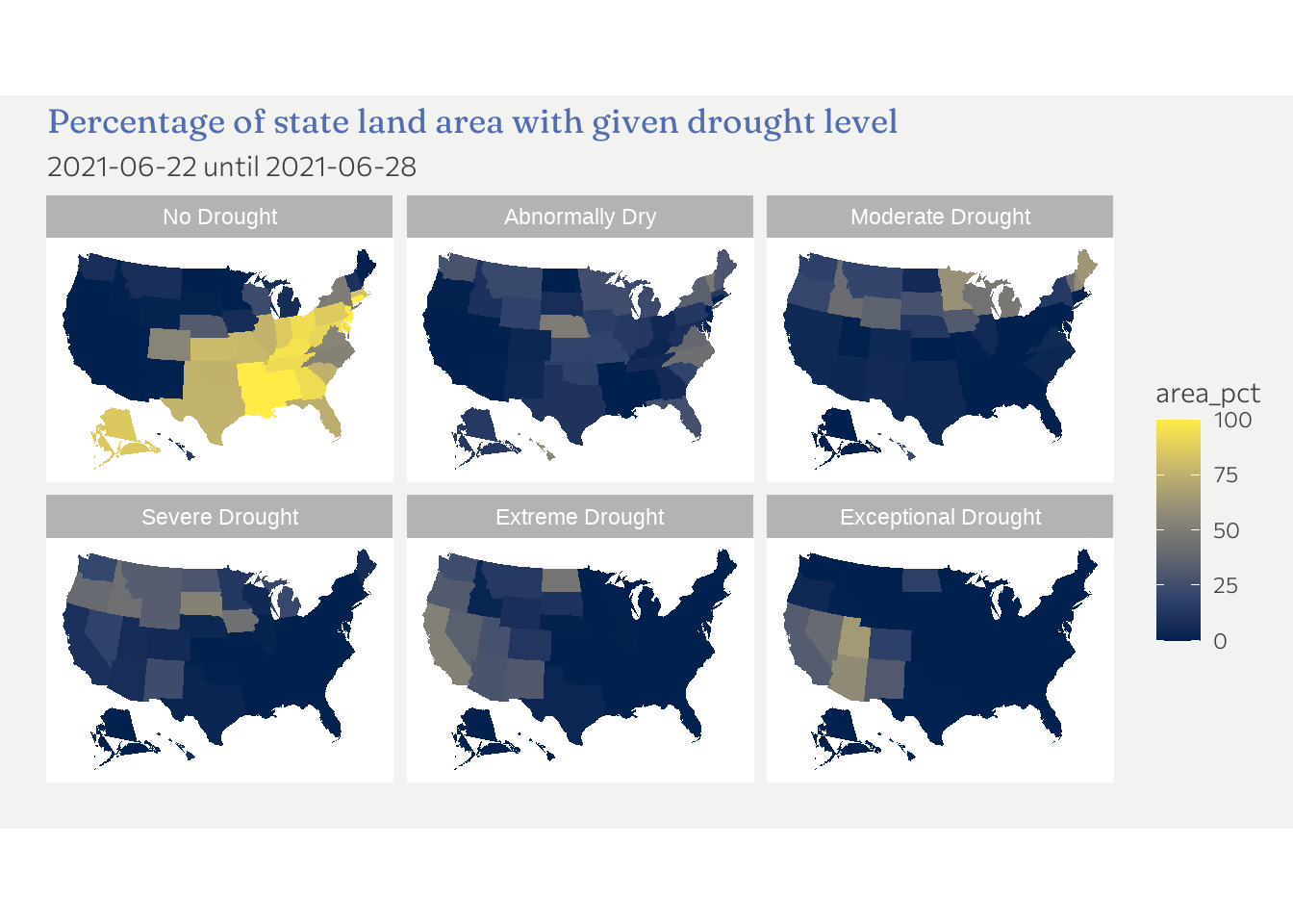
So this is ok but far from ideal. We see that states in the east and mid-east are least affected in this particular week. Droughts seem to prevail in the western part of the US. This is already an inside. There are a number of shortcomings thought. For one, its hard to know from the graph which states are most affected by drought (so higher number after the “D”).
So the followings insides (among others) are missing
- How do droughts develop over time
- which state is most affected / which state is least affected
Instead of a map lets quickly look at drought levels over time for California. A stacked area chart is helpful here.
d %>%
   filter(state_abb == "CA") %>%
   ggplot(aes(x = valid_start, y = area_pct, fill = fct_relevel(drought_lvl, "None"))) +
   geom_area() +
   labs(
      fill = "Drought level",
      x = "",
      y = "Percent of state area",
      title = "Drought levels for California over time.",
      subtitle = "2001 until mid 2021"
   ) +
   scale_fill_brewer(palette = "RdYlGn", type = "div", direction = -1) +
   theme(legend.position = "bottom")
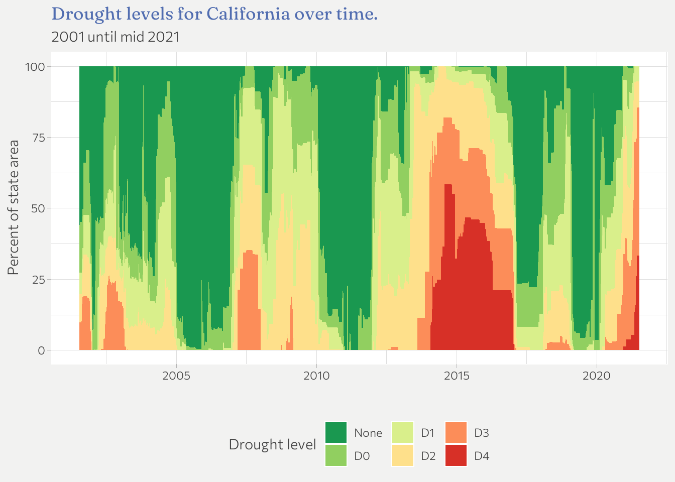
One could do that for each state or facet by the x most populated states etc.
Since I’m already spending more time than planned because plotting maps is new to me, I call it a day for now. However, I will come back to this data set since I still ant to experiment with animated graphs.
-
If you reproduce the plots that follow, the appearance will be different but the content is the same. This is because I use a custom theme that is tailored to work well with the overall appearance of this website (same font families, color palettes etc.). If you want to know the details of the theme, check out the code on Github. ↩︎