Analyzing CEO depatures
By Manuel Rademaker in R Data wrangling Data analysis Data visualization Tidyverse ggplot2
May 19, 2021
Description
The data this week comes from Gentry et al. by way of DataIsPlural. It contains the reasons for CEO departure in S&P 1500 firms from 2000 through 2018.
Data and variables
Taken from the Tidy Tuesday github repository.
departures.csv
| variable | class | description |
|---|---|---|
| dismissal_dataset_id | double | The primary key. This will change from one version to the next. gvkey-year is also a unique identifier |
| coname | character | The Compustat Company Name |
| gvkey | double | The Compustat Company identifier |
| fyear | double | The fiscal year in which the event occured |
| co_per_rol | double | The executive/company identifier from Execucomp |
| exec_fullname | character | The executive full name as listed in Execucomp |
| departure_code | double | The departure reason coded from criteria above |
| ceo_dismissal | double | A dummy code for involuntary, non-health related turnover (Codes 3 & 4). |
| interim_coceo | character | A descriptor of whether the CEO was listed as co-CEO or as an interim CEO (sometimes interim positions last a couple years) |
| tenure_no_ceodb | double | For CEOs who return, this value should capture whether this is the first or second time in office |
| max_tenure_ceodb | double | For this CEO, how many times did s/he serve as CEO |
| fyear_gone | double | An attempt to determine the fiscal year of the CEO’s effective departure date. Occasionally, looking at departures on Execucomp does not agree with the leftofc date that we have. They apparently try to balance between the CEO serving one month in the fiscal year against documenting who was CEO on the date of record. I would stick to the Execucomp’s fiscal year, departure indication for consistency with prior work |
| leftofc | double | Left office of CEO, modified occasionally from execucomp but same interpretation. The date of effective departure from the office of CEO |
| still_there | character | A date that indicates the last time we checked to see if the CEO was in office. If no date, then it looks like the CEO is still in office but we are in the process of checking |
| notes | character | Long-form description and justification for the coding scheme assignment. |
| sources | character | URL(s) of relevant sources from internet or library sources. |
| eight_ks | character | URL(s) of 8k filing from the Securities and Exchange Commission from 270 days before through 270 days after the CEO’s leftofc date which might relate to the turnover. Included here are any 8k filing 5.02 (departure of directors or principal executives) or simply item 5 if it is an older filing. These were collected without examining their content. |
| cik | double | The company’s Central Index Key |
| _merge | character | Merge details |
CEO Departure Code
| Code Number | Type | description |
|---|---|---|
| 1 | Involuntary - CEO death | The CEO died while in office and did not have an opportunity to resign before health failed. |
| 2 | Involuntary - CEO illness | Required announcement that the CEO was leaving for health concerns rather than removed during a health crisis. |
| 3 | Involuntary – CEO dismissed for job performance | The CEO stepped down for reasons related to job performance. This included situations where the CEO was immediately terminated as well as when the CEO was given some transition period, but the media coverage was negative. Often the media cited financial performance or some other failing of CEO job performance (e.g., leadership deficiencies, innovation weaknesses, etc.). |
| 4 | Involuntary - CEO dismissed for legal violations or concerns | The CEO was terminated for behavioral or policy-related problems. The CEO’s departure was almost always immediate, and the announcement cited an instance where the CEO violated company HR policy, expense account cheating, etc. |
| 5 | Voluntary - CEO retired | Voluntary retirement based on how the turnover was reported in the media. Here the departure did not sound forced, and the CEO often had a voice or comment in the succession announcement. Media coverage of voluntary turnover was more valedictory than critical. Firms use different mandatory retirement ages, so we could not use 65 or older and facing mandatory retirement as a cut off. We examined coverage around the event and subsequent coverage of the CEO’s career when it sounded unclear. |
| 6 | Voluntary - new opportunity (new career driven succession) | The CEO left to pursue a new venture or to work at another company. This frequently occurred in startup firms and for founders. |
| 7 | Other | Interim CEOs, CEO departure following a merger or acquisition, company ceased to exist, company changed key identifiers so it is not an actual turnover, and CEO may or may not have taken over the new company. |
| 8 | Missing | Despite attempts to collect information, there was not sufficient data to assign a code to the turnover event. These will remain the subject of further investigation and expansion. |
| 9 | Execucomp error | If a researcher were to create a dataset of all potential turnovers using execucomp (co_per_rol != l.co_per_rol), several instances will appear of what looks like a turnover when there was no actual event. This code captures those. |
Setup
require(tidytuesdayR) # to easily get the tidy Tuesday data
require(tidyverse)    # includes dplyr, tidyr, ggplot, forcats etc.
require(visdat)       # for visualizing missing data (and data types)
I always take roughly the same approach when analyzing data that is already reasonably cleaned but not fully tidy yet. Depending on the type of data, additional steps are necessary and some others may be skipped.
Here are the steps I’m going to take:
- Load data and get an understanding of the variables
- Develop interesting questions/hypotheses
- Tidy/clean
- Address questions/hypotheses
The goal is to come up with 2-3 insightful, publication ready visualizations.
Load data and get an understanding
tt  <- tidytuesdayR::tt_load('2021-04-27')
ceo <- tt$departures
dim(ceo)
## [1] 9423   20
vis_dat(ceo)
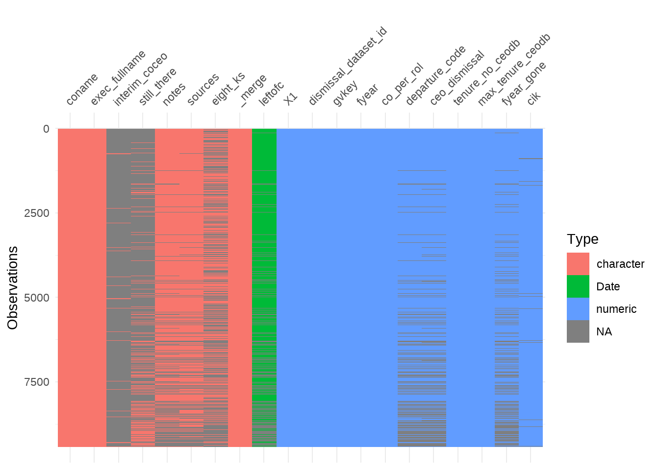
Alright so there are 20 columns with 9423 observations.
Some character and some numeric columns and one date/time column.
There are missing values but they seem mostly “natural” in a sense that they just
mean, that the column doesn’t apply to that observation (e.g., interim_coceo: most CEO are not interim CEOs).
Develop questions / hypotheses
Ok, looks like there are not many variables that actually explains more precisely why a CEO might have departed the way he did (e.g., the competition had stronger growth, winnings declined etc.). So the main point of the data set is to compare the reasons for departure as given by the data set.
Here are a couple of questions that come to my mind:
- What is the distribution of CEO departure reasons (by year (or every 5 years), overall)?
- Does the distribution change over the years (i.e. are CEOs now more likely to be removed for legal reasons for example)?
- Do CEOs that are fired (3 & 4) get fired again more often than others? Or in general: whats the likelihood of departing for reason x given reason y for dismissal.
- Look at companies and their CEO turnover. Which companies stand out (e.g., because they dismiss many CEOs).
- If possible, look at the history of some interesting CEOs. Maybe there are some that stand out (e.g. because they always left for legal reasons).
Address questions / hypotheses
Question 1: Overall distribution of depature
Lets start by getting a feel for what the distribution of departure is overall.
ggplot(ceo, aes(y = departure_code)) +
   geom_bar(fill = main_color) +
   labs(
      title    = "Reason for CEO departure",
      x = "",
      y = ""
   )
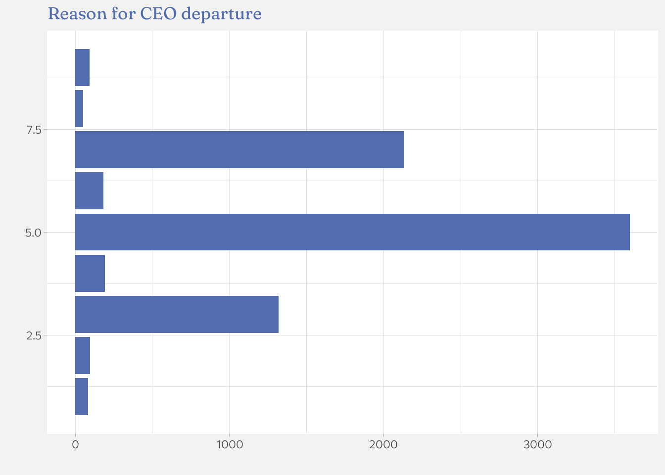 This is a unpolished raw first plot.1
ceo %>%
   group_by(fyear, departure_code) %>%
   count()
## # A tibble: 255 x 3
## # Groups:   fyear, departure_code [255]
##    fyear departure_code     n
##    <dbl>          <dbl> <int>
##  1  1987              5     1
##  2  1992              1     1
##  3  1992              3    10
##  4  1992              5    44
##  5  1992              6     1
##  6  1992              7     2
##  7  1993              1     2
##  8  1993              2     1
##  9  1993              3    25
## 10  1993              4     1
## # ... with 245 more rows
Hmm, apparently there are more years than what the description said (2000 - 2018, if I understood correctly). The earliest is 1987.
Before I continue, I am going to do to some data wrangling
- I don’t like working with the codes. I think for plots its much more meaningful to have the actual labels –> create label column
- I make
fyeara date column as this makes working with axis breaks and labels much easier. - Looking at the plot, three labels stand out:
3(bad job performance)5(retired)7(other) I will only keep these plus4and6. I ignore Death (1), Illness (2), Missing (8), and theexecucomperror label as they are not meaningful or simply not too interesting.
ceo_reduced <- ceo %>%
   filter(departure_code %in% 3:7) %>%
   mutate(
      departure_label = as.factor(recode(departure_code,
         `3` = "Bad performance",
         `4` = "Legal",
         `5` = "Retired",
         `6` = "New opportunity",
         `7` = "Other")),
      fyear = lubridate::make_date(fyear)) %>%
   relocate(fyear, departure_label)
So here is the first plot (+ polishing).
ceo_reduced %>%
   group_by(departure_label) %>%
   count() %>%
   ggplot(aes(y = fct_reorder(departure_label, n), x = n)) +
   geom_col(fill = main_color) +
   labs(
      title = "CEO depature by reason",
      subtitle = "S&P 1500 firms between 1987 - 2019",
      x = "",
      y = "",
      caption = "Source: Gentry et al."
   ) +
   scale_x_continuous(breaks = scales::breaks_width(500))
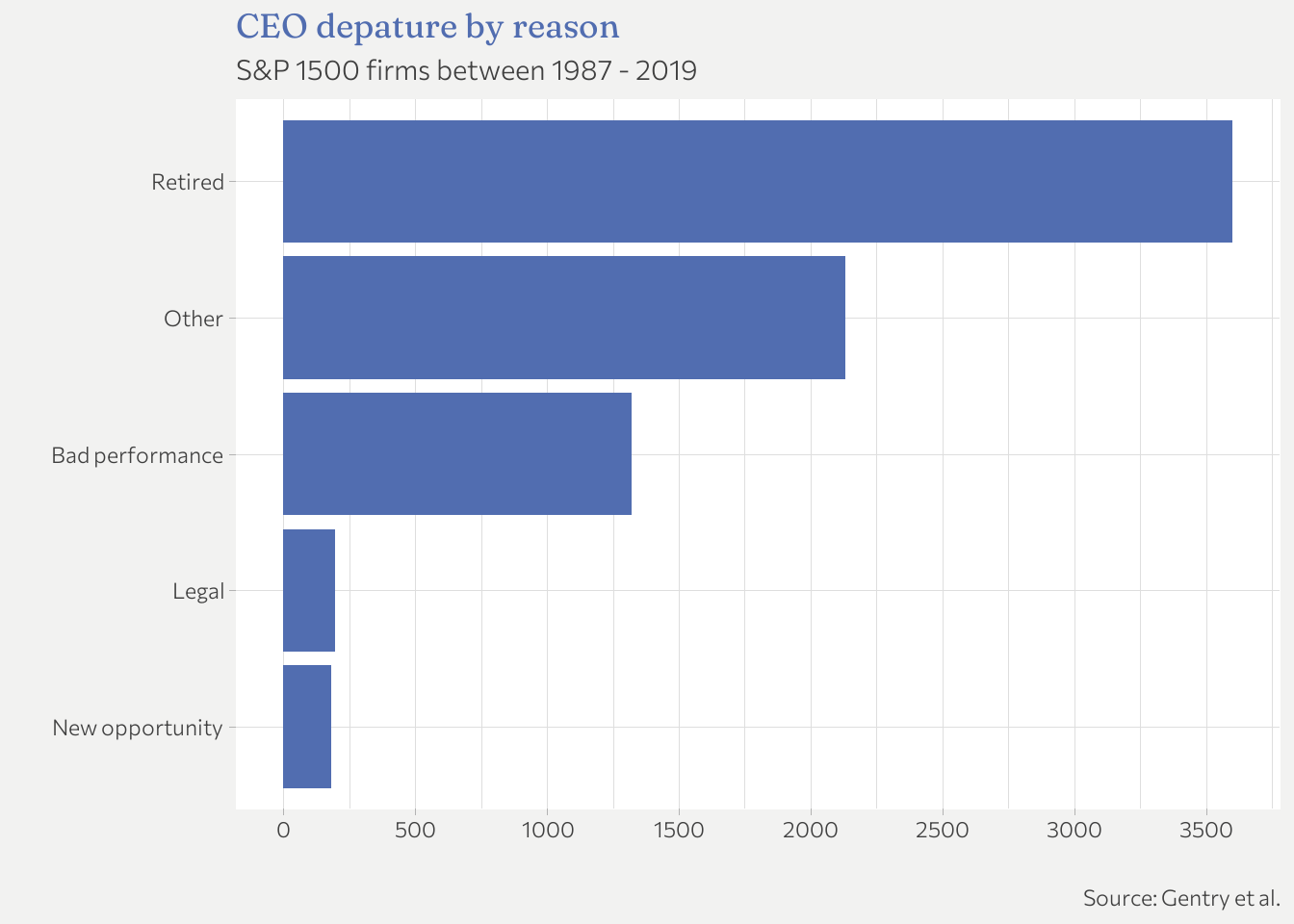
Most CEOs retire or they leave their position because of a merger, restructuring or some other event subsumed in “Other”. The most interesting to me, however, are bad performance and legal. I will focus on them more.
Question 2: Reason for departure over time
Lets see if there are any changes over time.
ceo_reduced %>%
   group_by(fyear, departure_label) %>%
   count() %>%
   ggplot(aes(x = fyear, y = n, color = departure_label)) +
   geom_line() +
   labs(
      title = "CEO departure by reason over time",
      subtitle = "S&P 1500 firms between 1987 - 2019",
      color = "Reason",
      y     = "",
      x     = ""
   )
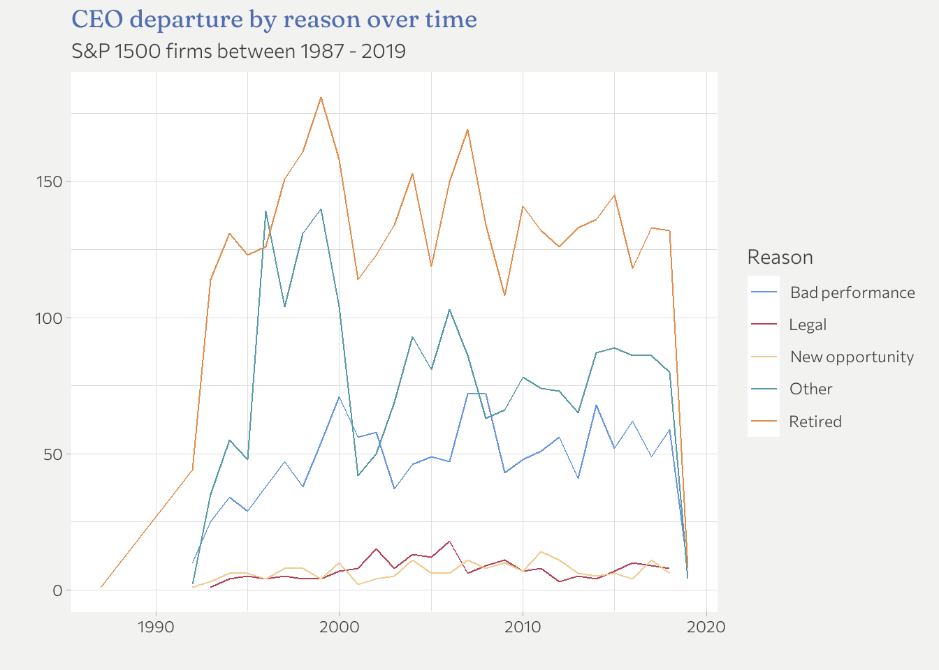
I think its better to look at ratios than absolute numbers here because there are not always the same number of departures per year (especially at the beginning and the end of the time period available). I delete 1987 as it not representative with n = 1. In addition, the order of the labels should match the lines.
ceo_reduced %>%
   filter(fyear != "1987-01-01")  %>%
   group_by(fyear, departure_label) %>%
   count() %>%
   group_by(fyear) %>%
   mutate(share_fyear = n/sum(n)) %>%
   ungroup() %>% # for fct_reorder!
   mutate(departure_label = fct_reorder(departure_label, -share_fyear, last)) %>%
   ggplot(aes(x = fyear, y = share_fyear, color = departure_label)) +
   geom_line() +
   labs(
      title = "CEO departure by Reason over time",
      subtitle = "S&P 1500 firms between 1987 - 2019",
      color = "Reason",
      x     = "",
      y     = "% of total departures"
   ) +
   scale_y_continuous(labels = scales::label_percent()) +
   scale_x_date(
      breaks = scales::breaks_width("4 years"),
      labels = scales::label_date("%Y")
      )
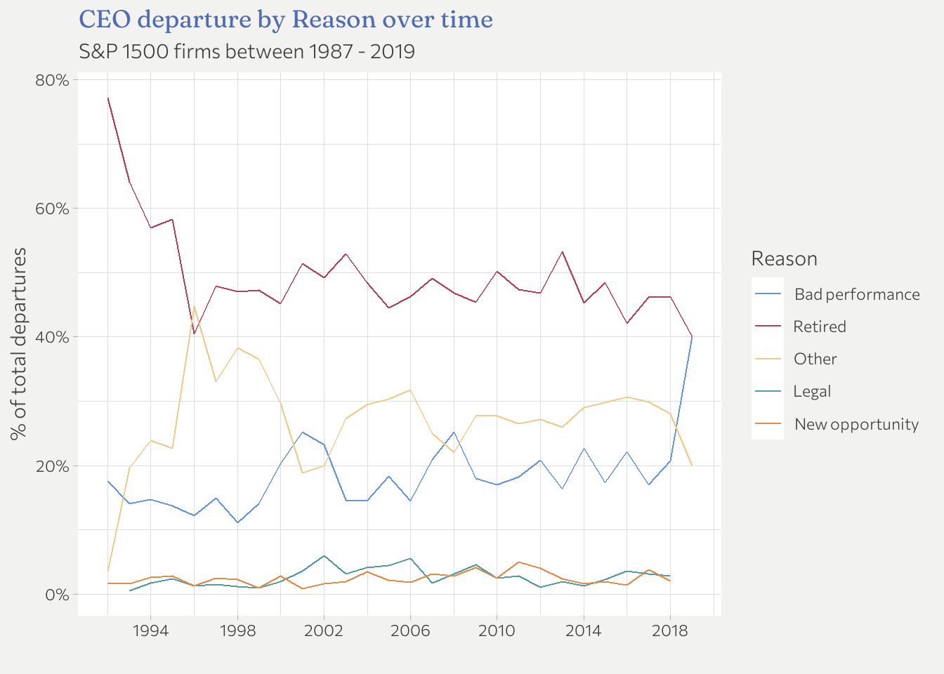 I don’t see any obvious patterns. Maybe a slight increase in “Bad performance”
departures over the years. But its not particularly pronounced.
I don’t see any obvious patterns. Maybe a slight increase in “Bad performance”
departures over the years. But its not particularly pronounced.
Question 3: Trajectories
Lets now focus on the trajectories of those CEOs that appear more than once in the data. Of course, this only works if I have some CEOs that appear at least twice.
First I get all CEO that appear at least twice.
ceo_al_twice <- ceo_reduced %>%
   group_by(exec_fullname) %>%
   mutate(appears_al_twice = n(), .after = departure_label) %>%
   filter(appears_al_twice > 1) %>%
   ungroup()

length(unique(ceo_al_twice$exec_fullname))
## [1] 471
Ok, there are 471 CEO that appear at least twice in the data. This is something to work with. Lets take a look:
# Note: divide to get the unique values
table(ceo_al_twice$appears_al_twice) / c(2, 3, 4)
##
##   2   3   4
## 430  39   2
There are only a few left that appear more than 2 times.
ceo_changes <- ceo_al_twice %>%
   arrange(fyear) %>%
   group_by(exec_fullname) %>%
   mutate(departure_no = 1:n(), .after = departure_label,
          departure_no = fct_inorder(recode(departure_no,
             `1` = "First departure",
             `2` = "Second departure",
             `3` = "Third departure",
             `4` = "Fourth departure"))) %>%
   ungroup()

ggplot(ceo_changes, aes(x = departure_no, y = departure_label, group = exec_fullname)) +
   geom_line() +
   labs(
      x = "",
      y = ""
   )
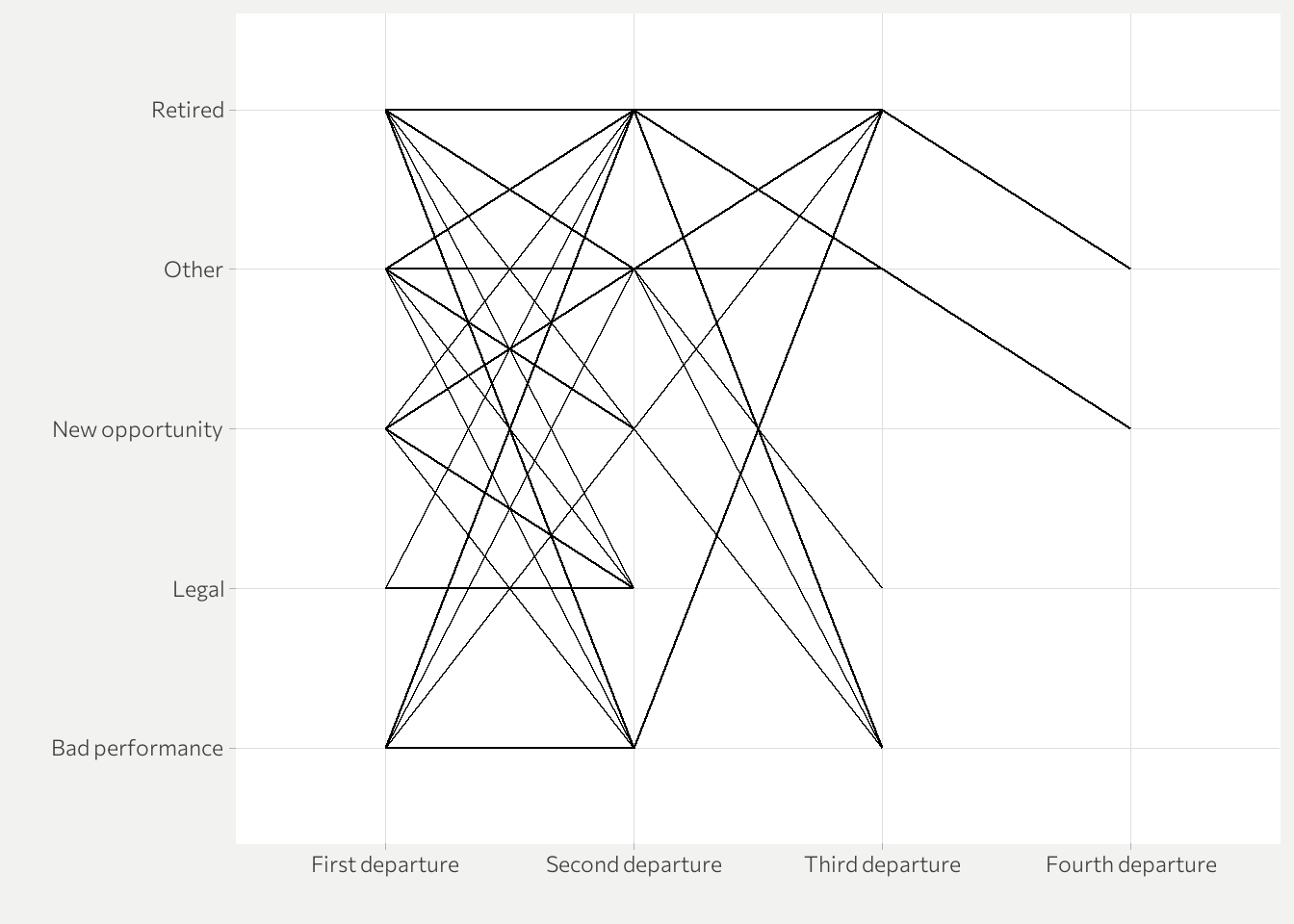
This is not really meaningful yet. A couple of things will help.
- Highlight the path of the 2 CEOs that had 4 changes and label them.
- Use an appropriate techniques to address overplotting to also highlight which changes appear more often.
For the latter I am going to use the alpha parameter and the size aesthetic.
(This took me a while to figure out…)
ceo_changes_freq <- ceo_changes %>%
   count(departure_label, departure_no)

ceo_4_changes <- ceo_changes %>%
   filter(appears_al_twice  == 4)

ggplot(ceo_changes, aes(x = departure_no, y = departure_label)) +
   geom_line(aes(group = exec_fullname), alpha = 0.2) +
   geom_point(
      data = ceo_changes_freq,
      mapping = aes(size = n)) +
   geom_line(
      data = ceo_4_changes,
      mapping = aes(group = exec_fullname, color = exec_fullname),
      show.legend = FALSE) +
   geom_text(
      data = filter(ceo_4_changes, departure_no  == "Fourth departure"),
      mapping = aes(label = exec_fullname),
      nudge_y = -0.1
      ) +
   labs(
      title = "Trajectories of the reasons for CEO departure",
      subtitle = "S&P 1500 firms between 1987 - 2019",
      x = "",
      y = "",
      size = "Number of cases"
   ) +
   theme(legend.position="bottom")
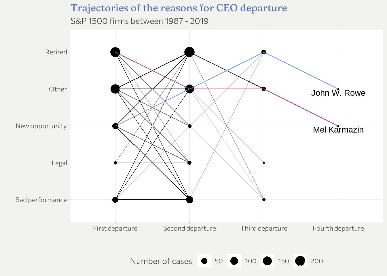
Two CEOs appear 4 times in the data set. None of them left for legal or bad performance reasons. Interestingly, retirement doesn’t seem to be “final”. Some CEO come back. All in all, there is no overwhelmingly clear connection but certainly some interesting insights.
Summary
That’s it for this data set. There is of course always more to discover, however,
I already used more time than I planned because it took
me a while to figure out how to make the last plot. I had never really used
the size aesthetic before so there was some trial and error necessary in order
to find out how to use it most effectively.
-
If you reproduce this plot (and the following as well), the appearance will be different. This is because I use a custom theme that is tailored to work well with the overall appearance of this website (same font families, color palettes etc.). If you want to know the details of the theme, check out the code on Github. ↩︎